* Note: There are 3 externally linked GIFs in this post and many images. Please watch your mobile data.
Outline:
1 — Past critiques
2 — How about in 2020?
3 — Learning from others
4 — Is there no hope?
5 — Concluding thoughts
6 — Bonus stage
In April 2017, SMRT — a transport operator in Singapore — introduced a new set of trains, which came with new LCD screens. These probably didn’t come cheap, but the potential benefit is great, since the screens can dynamically change to show different information.
For context, the older system looks like this:

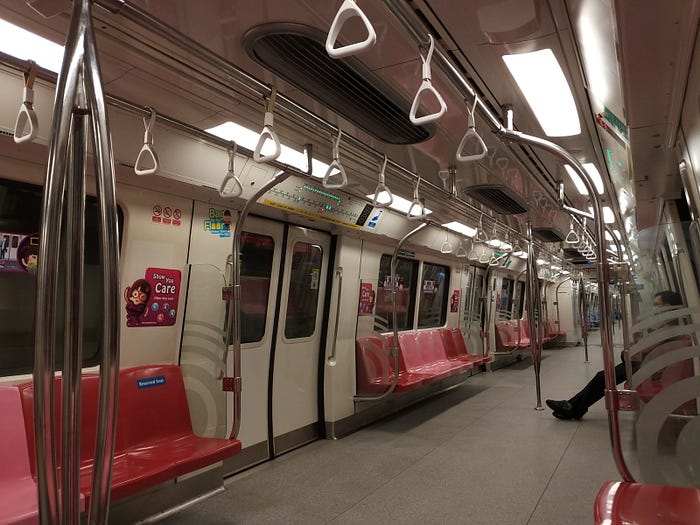
This is the first version of STARiS (which stands for SMRT Active Route Map Information System). It shows a train map for SMRT’s two main train lines, which most commuters would already be familiar with as they were the only lines in service for nearly 15 years until a third line opened in 2003. Green LEDs indicate the stations on the route, and a blinking red LED indicates the next station.
The biggest problem with the old display was that as new lines and stations were constructed, it would become outdated and difficult to update. Understandably, it’s a pain to rewire circuits and reposition LEDs and reprint maps for 50+ trains every few years.
With STARiS 2’s dynamic display, this wouldn’t be a problem since only the graphics would need to be updated. However, it turns out that what is shown on the screen is perhaps more important than the screen itself. Let’s look into STARiS 2 and the problems with its implementation.

1 — Past critiques
This first section is a review of existing critiques of the train displays. Feel free to skip this if you just want to read my analysis in the next section.
1.1
This article from Tech in Asia (published 5 Jul 2017) was the first to really go into detail on the problems with the initial design of STARiS 2. I won’t go into detail of the critique, but here’s a brief summary of the author’s points:
- It’s ugly. Inconsistent fonts, unnecessary gloss and reflection effects, unprofessional feel.
- Doesn’t show the full train line most of the time, only 5 stations. In that respect, it doesn’t do a good job replacing STARiS 1.
- It shows a geographically accurate train network map, but not the abstracted system map that commuters are used to. Geographical accuracy is not relevant to the commuter. [This has been removed in the current version]
- Between stations, it shows a slideshow of nearby landmarks, which are not labelled and are not helpful in journey planning. [This has been removed in the current version]
- It shows a map of the station when arriving, but doesn’t tell which carriage you’re in, which makes it less useful.
- Text labels on the station map slowly animate one at a time.
- The station map is so detailed it’s hard to understand, especially when standing further away.
- Missed opportunities: Icons, multilingual displays, and bus connections from stations.
I find myself agreeing with most of his points. We will later see that some of these problems are still present.
1.2
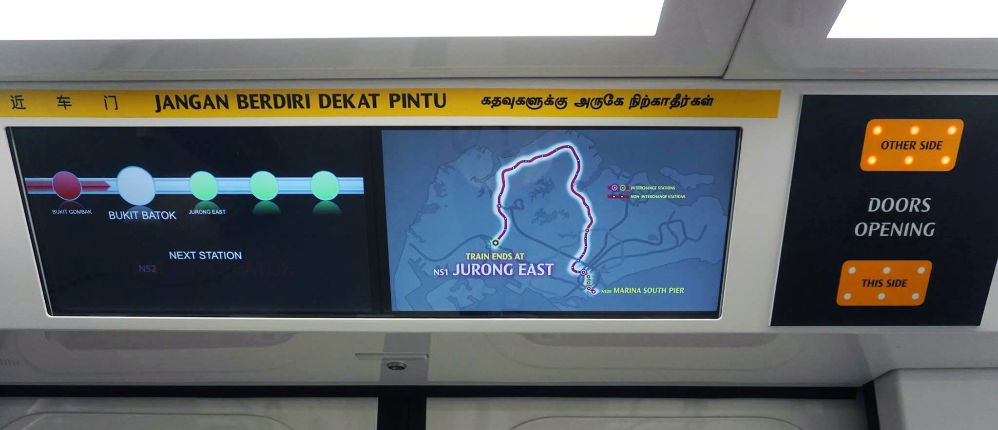
Here is a blog post made in response to the previous one, posted on the same day. Here are some of the points which struck out to me more:
- Static system maps are already on the train walls, so there is no need for the dynamic display to show it either.
- There is value in a geographically accurate map as it lets commuters judge the travel distance/time.
- Multilingual displays don’t work as well as many station names are literally directly translated into the other languages. “May be helpful in the future, but not a direct requirement.”
- He also believed that there is no need to show connecting bus services as there are already notice boards in the MRT station for that kind of information.
For the geographical map, in practice we can’t see the train’s current position, and there’s no scale for reference, so it’s not that easy to estimate travel time. As we will see later, there are more elegant ways to communicate information like this to the commuter.
My overall response to the blog post is: If the reason for the display to not show something is because something else already does the job better, then why have it at all? Sure, some information is more important than others, and sometimes that’s up to an individual’s value judgment, but information that we agree is important can always be represented in different ways.
1.3
This is yet another opinion blog post posted on (surprise, surprise) the same day. I’ve picked out a few sections that stood out to me.
No, this means the displays aren’t really synchronized at all. They’re just working on independent video loops, with appropriate instructions being passed from the controller in the driver’s cab to move to the next video in the playlist. It might have worked with the old flashing lights (and the same controller is used for both), but it won’t work very well here.
The TechInAsia article mentioned that the videos don’t exactly show the full system map, and only a few stations at a time. In my opinion, there’s no need to, when there’s a hardcopy of the system map pasted on the wall a stone’s throw away. It’s not that big, of course, but it’s there. If you want a bigger one, look up above the windows.
And there’s a minor point about displaying train disruption information:
… the Japanese also use their screens to tell people about disruptions on whatever part of the network, including sections not run by the railway company that manages the section of line you’re on.
And here’s a video showing STARiS 2 in April 2017, if you want to make a comparison.
2 — How about in 2020?
One way to start dissecting the design is to look at it from the perspective of the commuter. Since we’re talking about displays in a train, we’ll think about commuters already on board a train. What does the average commuter want and need to know?
Well, STARiS 1 gives us some insight into what is “critical information” when you can’t just put anything you want. The designers decided that showing the full line and the train’s immediate position were the things commuters needed to know the most.
I think a typical commuter would want to look at the display for information during a few moments: boarding the train, along the trip, right before a train arrives at a station, and when the train is stopped at a station. Let’s see how STARiS 2 helps the commuter at these moments.
2.1 — Boarding the train
So you’ve got on the train, and maybe one thing you’re thinking to yourself is, “Gee, I hope I boarded the right train. I wouldn’t want be going the wrong direction.”
(For additional drama, you could also pretend you’re a tired morning rush-hour commuter going to work that you’re almost late for.)
So you take a glance at the display above the door, and you see this:
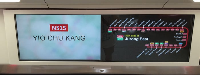
We see the current station, a diagram of the train line, and the train’s eventual destination. Seems alright. But it could be better.
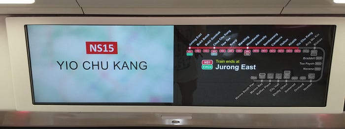
Notice how we don’t see the train’s current position on the diagram. The display knows we’re at Yio Chu Kang, so why isn’t it shown on the full map too? Note that this map never changes at any point on the trip. It’s baffling.
Here’s one quick photoshop fix. Visually, you can see the stops where the train will pass, where it currently is, and where it’s going. No need to get distracted with places you aren’t going to.
Now, hopefully you’ve boarded the correct train. Next, there’s a warning for the doors closing.
Nothing too much wrong here, but do they really have to go with red text on a black background? It’s not the easiest to read, and the reflection caused by the bright environment doesn’t help. Ever tried looking at your phone in dark mode under the sun?
Edit (2021–04–07): I’ve read some people thinking that this animation is also problematic, since it blocks people from being unable to see the destination when they rushed to board the train before the doors closed. I think this is a valid problem, which maybe could be solved with better use of the two whole screens of real estate. But then again, if you were boarded the wrong train as the doors were closing you probably wouldn’t have been able to run out in time anyway.
2.2 — During the journey
Now, you’re halfway on your trip, and you want to know where you are. Perhaps, you’d also want to know how much more time there is to your destination. Let’s see how STARiS 2 helps with that:
This animation is a little over 8 seconds long. It takes 6 seconds for the next station’s name to fade in from the blank screen. That’s ridiculous. When I look at an information display, I want to see the information immediately.
Do you want to have your head craned up for 6 seconds more than necessary waiting for the information you want to show up? You could’ve missed something on a live stream on your phone.
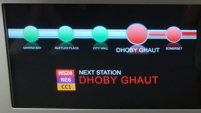
Again, we have light text on a black background. The font size is also quite small. To get a feel of why this is bad, try moving away from your device’s screen and try to read it from far. And try it from the side. Maybe try reading it from here:
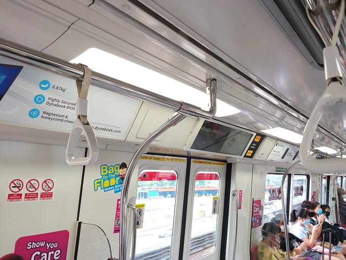
It’s already not easy to make out the contents, why make it harder with small font sizes and poor colour choices? So what if the North-South Line is red? That important bit of text doesn’t have to be red, it has to be read. (haha!)

The colour fill of the line moving to the next station gives an indication of the direction of travel. Thankfully, this is mirrored on opposite doors, consistent with the forward direction of the train. So now we know that these displays can be engineered to show different things.
However, nothing on it shows information about how far the next station or any subsequent stations are. There is nothing about the train’s last stop or anything beyond these 5 stations. There is so much wasted potential here.

Instead, we get to see this screen on the left and advertisements on the right, for the entire duration between stations. You’re looking at this slow animation cycling over and over again, while the train is cruising along the chasm between Yio Chu Kang and Khatib during peak hour. It’s a preview of hell.
Do we really need animations like a PowerPoint presentation? Does it have to be in dark mode? Do we really need to show the same 3 ads the entire time? The content’s going to be repetitive no matter what, so at least make it look good. Surely we can do better than this.
2.3 — Arriving at a station
The train is reaching a station. Perhaps you were asleep and got jolted awake by the deceleration, and you didn’t quite catch the announcement over the speakers. Taking a look at the display, you see this:
The GIF’s a little long, so here’s a sequential screenshot of that:
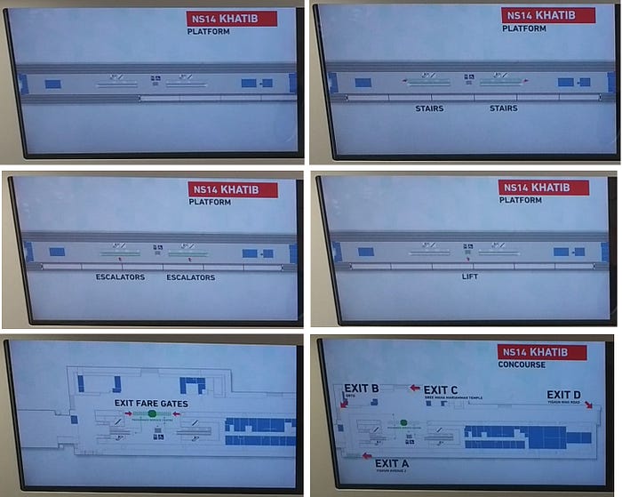
This is a little trickier to unpack. It’s easier to read now since it’s on a bright background. There’s a 3D model of the station, and it looks like they used the station schematics to create it, since there’s pillars and walls drawn to scale. Someone was definitely very proud of themselves when they created this, and for every station on the line, no less.
One thing that struck out to me is that the entire time, the advertisements are still playing. That’s a whole extra screen of space that could’ve been used to put something like the station name, instead of squeezing it at the top corner.
Once again, the text is slow to animate. I think icons for stairs and escalators could be used here instead. There isn’t a need to make it to scale either, that’s unnecessary detail (look at how attention-grabbing the blue areas are — yet they’re not important landmarks). I’ll go more into this in a later section.
Also notice that the display doesn’t show which carriage you’re in. Is is too much to ask to have that?

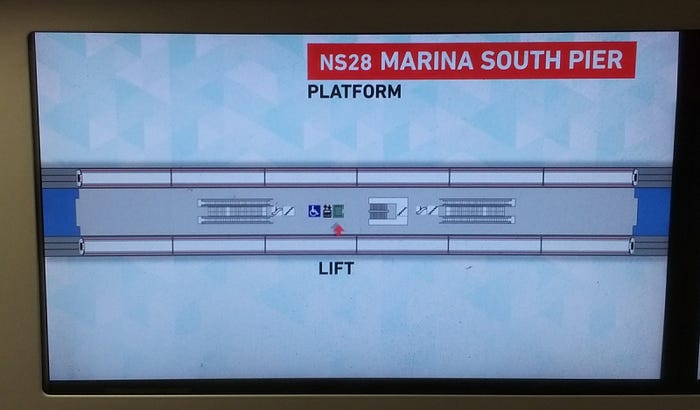
I’m going to be nitpicking here, but this is from the same display on the same train as the previous set of photos, for the next station. See how the train has jumped to the opposite track? It may seem like a small thing, but it means that your brain may have to re-orientate its mental model of the platform depending on which station you’re at.
It’s as if some parts seem overdone, yet others are half-done, at the same time.
For interchange stations, it’s even more important that this part is done correctly. You have people exiting the station, but you also have people going to other platforms to transfer to another line. Let’s see how this is done:
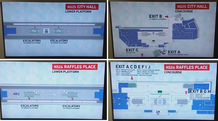
The tracks around City Hall and Raffles Place literally inter-change so that commuters can transfer to the other line without moving to a different platform. Here’s a diagram to visualise:

If you’re like myself, you wouldn’t be able to remember which train is on the other side, and you’d have to figure out whether to take the escalator to the other platform. You’d sometimes end up taking the wrong escalator as well. I think this would’ve been something useful for STARiS 2 to show, but unfortunately it doesn’t.
My main problem with the current graphic is that it is an information overload. It feels like it’s trying to show too much at the same time. I would rather they prioritise showing where the nearest exit vectors are (to escalators and lifts), to get them out of the train platform quickly. It’s not just for your own convenience, it’s for crowd control as well.
Most stations in Singapore have escalators that lead to the same exits areas, so you’d end up at the same place anyway. More careful attention can and should be put to station platforms with less typical layouts.
2.4 —Train has arrived at a station
Perhaps you still aren’t quite sure which station you’re at, even though the doors are already open. You check the display just to be sure:

It’s doing the fade-in thing again! WHY?
For this station, the doors were open for 20 seconds until the closing signal was given. If it’s crowded or you’re carrying bulky items, that’s not a lot of time to get out of the train. Add on some cognitive delay, and this 2 second animation could actually cause you to miss your stop. Squinting out of the carriage window to read a printed label of the station name could be more reliable than this.

The bright background is better for readability here, but the strange fog effect isn’t helping anyone here (it’s not a camera issue). Perhaps a larger or thicker font would be good too, since the space is being underutilised. It’s not like we really need it for anything else, like including translations for 3 other official languages that the country uses.
3 — Learning from others
Believe it or not, you don’t have to be a creative genius to make good designs. You certainly don’t need to come up with a good design on the first try either, you can improve on it over time. Which makes one wonder why STARiS 2 has hardly changed in the 3 and a half years since its debut.
The section title already gave it away, but one trick to start improving a design is to look at what other people are doing. I’ve looked through videos of train displays that I could find on YouTube, so these are videos anyone can find easily. You’ll notice that nearly all of them are from Japan, and for good reason. Let’s see if there’s anything we can learn from them.
3.1 — Journey information
With Japanese train lines, often there are so many stops that it’s difficult to show everything on the screen. Even so, it’s not impossible:
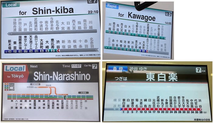

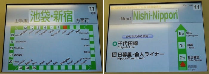
There are differences depending on the company and the train, but there is generally a very economical use of space, even on the single screen displays.
Some of these also have displays of the next few stations instead of the full line, similar to what STARiS is doing now.
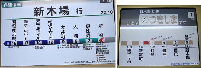
Notice how the name of the next station or the destination station is highly visible. You are almost always able to tell where you are on the train line, and where the train is going. As an added bonus, they even put the carriage number, a clock, and the estimated travel time, which are all relevant information. No need for custom-made extra-wide screens. If you do have wide screens though, here are some ideas:


Now, some people might be thinking, “Well obviously Japanese characters are so much more compact than English letters, and they can write vertically, of course it’s easier for them to put it all in one screen! Look, the Sydney Metro graphic barely fits!”
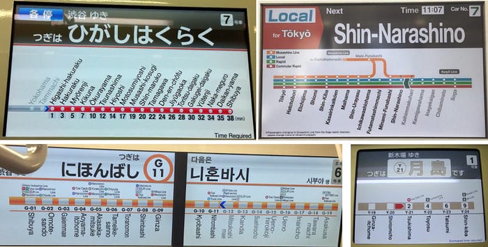
Really, this isn’t rocket science.
3.2 — Approaching the station
Here’s a refresher of what we see on STARiS 2:

And here’s what train displays on some Tokyo lines show:
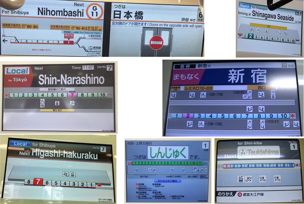
The big difference here is abstraction.
Whereas the graphic in STARiS is drawn to scale and slowly animates text labels, here we see what is crucial information for a commuter who is about to leave the train — is this the correct stop, and how do I get out. Having the train direction and car indicated helps the commuter know where to walk towards after alighting.
Using icons for elevators and stairs reduces visual noise on the graphics, making it easier and quicker to process. Most of the time, you don’t need to know exactly where something is, but just the general direction. This gets the job done well.
These also typically show additional information for transfer stations, which are relevant for SMRT since there will only be more of those as LTA expands the train network. In the Japanese trains, the transfer lines are labelled in full, unlike with STARiS where we have to guess what “NE6” and “CC1” mean.
3.3 — Other information
Dynamic screens can show dynamic information. In STARiS, the main use of this is with the advertisements, which isn’t very imaginative. There used to be a photo slideshow of landmarks at the next station, but it was removed at some point, probably because nobody liked it very much. I personally didn’t.
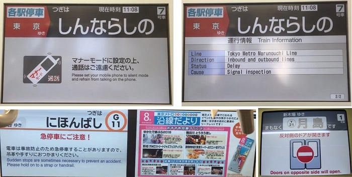
Above, we have a few examples with safety and courtesy reminders, and most notably train delay information. That would be nice to have instead of having to check SMRT’s Twitter for updates. They could even show early closure dates and times with the displays. Why are they still printing out hardcopy posters every few months?
4 — Is there no hope?
The lackluster STARiS 2 were installed on the newest trains at the time (2017), and in the 3 years since there were only minor adjustments without significant improvement to the overall experience.
LTA recently announced that the oldest trains are getting replaced in 2021. That’s a service lifetime of 30 years (from 1987). I would personally be appalled if I’m still seeing the same STARiS 2 in 2050.
As much as we want to trust that SMRT is improving over time, how do we know if that trust isn’t misplaced? Well, recently I took a trip to Woodlands to take a look at the new Thomson-East Coast Line, operated by SMRT.
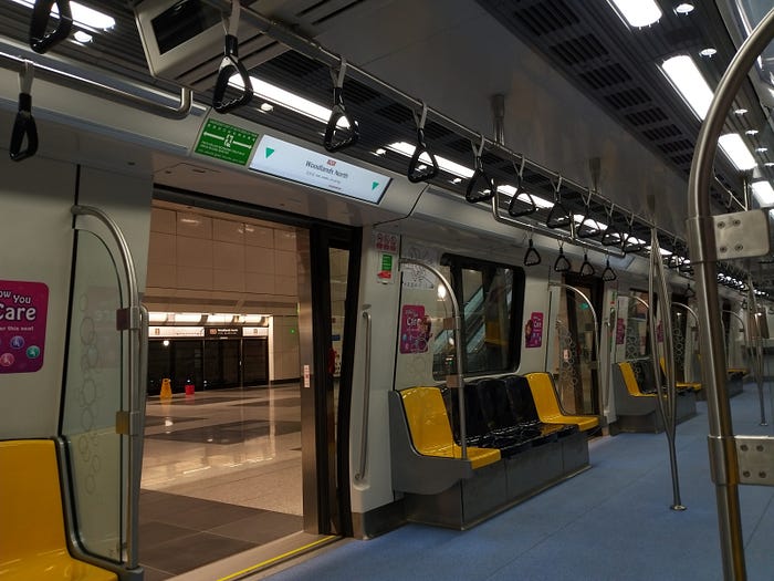
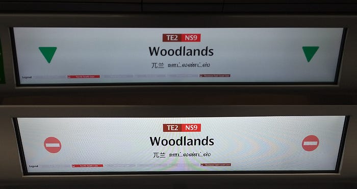
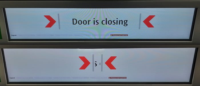
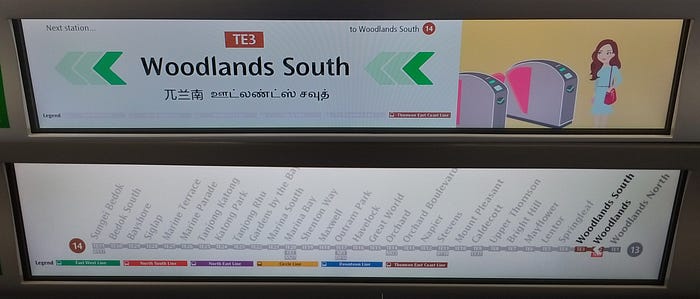
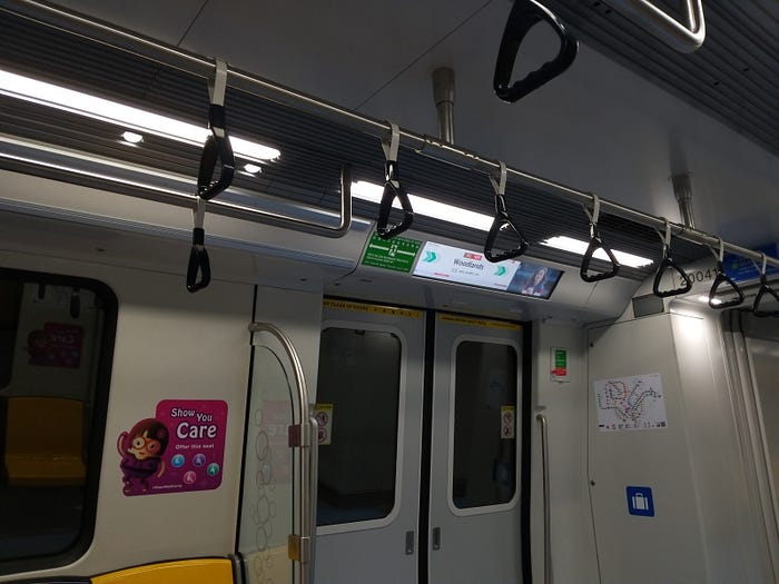
It’s almost as if the designers saw everything wrong with STARiS 2 and did everything they could to avoid them. Of course, being underground the entire time helps with visibility. It has clean layouts with little noise, dark text on bright backgrounds, and visual hierarchy for the most important information. The typeface (Ocean Sans) is consistent with LTA signages and system maps.
The ads get out of the way near the stations. The 5-door carriages means there is always a display relatively close to you on average, compared to the older 4-door trains. It even throws in the cheeky multilingual station names for good measure.
That said, perhaps they went overboard with the content cutting, since there’s nothing like the train-at-platform diagram shown at all. It’s not perfect, but it certainly learnt a good deal from the mistakes of STARiS 2.
The great thing about these electronic displays is that they can be changed at all, and people can continue to improve them over time. And it’s not like Singaporeans lack inspiration or interest in improving them. Take a look at some of these design concepts:
After seeing things like this, I can at least be cautiously optimistic of the future.
Edit (2021–04–07): There’s also this analysis + redesign article from 2018 which I missed out in my original research.
5 — Concluding thoughts
There are two main ideas I want to highlight here. First, here’s one of the takeaways from the Tech in Asia article I referenced earlier.
Lesson: Always design with the user in mind. When someone uses a map, one of the most common questions on their mind will be “Where am I?” The Singapore train display is the epitome of technology-centered design, while Japan’s is the epitome of a user-centered one.
Indeed, it’s easy to get carried away with new technologies and ideas. However, just because something can be done doesn’t mean it should. As designers, it’s crucial to keep asking ourselves, “what does the user really need and how do I give it to them?” In the context of train displays, the need is information, and the method is visual communication.
A single designer can’t pretend to be every single user, but things like one-on-one user interviews and testing can help us pretend with a little more finesse.
Second, in pursuit of excellence: Oftentimes for a project (especially non-crucial ones) we come up with a draft, look through it a little afterwards, then give ourselves a pat on a back for a job well done. Even this very post isn’t exempt from that treatment.
It’s a trap we fall into sometimes, but that’s okay since you can’t get everything perfect the first try. What we can do is improve it over and over again. We can iterate. Articles get edited, apps have updates, and video games have patches, for the same reason — turning something that is merely “good enough” into something approaching perfection.
We should learn to reconcile imperfections when they happen, and encourage improvement.
Edit (2020–10–03):
I took the East-West Line (the green train line) yesterday and checked if there was anything different with the graphics. I saw this:
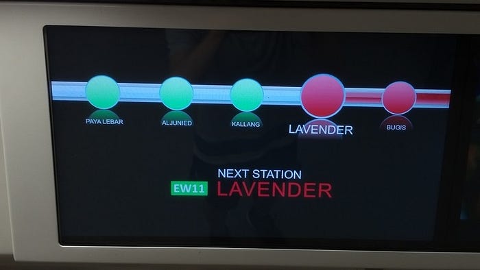
Turns out the red text isn’t about “red line uses red text”, since the green line doesn’t use green text here. Rather, someone thought that red text is the right choice here, along with the black background.
Maybe it looks fine on a bright computer screen in an office, but on the train, not so much.
Also here’s a look at the route map:


6 — Bonus stage
6.1 — Full videos, in Technicolor
Taken by myself on North-South Line and Thomson-East Coast Line, respectively.
6.2 — Two trains?
6.3 — JR Yamanote Line
One of my favourites, a true loop line.
6.4 — Closer look at JR East train display
All photos are taken by myself unless stated otherwise in the captions.